It’s a rainy summer day and I have made the trip to downtown Brooklyn to meet with Irene Camp and Jennifer Mitchell, Developmental Director and Executive Director, respectively. They’re located in a big old warehouse of a building at a busy intersection near the Fulton Street Mall.
It’s late in the day and the regular office staff has gone home, but there are still some students and staff working on terminals and end-of-the-day stuff. The administrative offices are located to one side, with offices and a large waiting room. There, I finally meet them, two engaging, cheerful, and optimistic women who love what they do and want you to know about it.
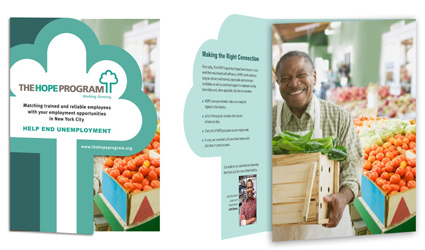
After a brief tour of their facilities, we sit down and talk about what they are looking for in the design and the brochure. First they bring me up to speed on how far the project has come and their take on the previous design work. The earlier designs they thought were too boxy, rectangular images with columns of type, and the overall look was not really distinctive. Jennifer then showed me an example of something she liked. It was from a different non-profit that served a similar mission. It was simple, bold and modern featuring close up black and white images of clients silhouetted against a white background and areas of deep blue and red. They used a simple sans serif typeface, a layout that allowed for lots of white space.
From there I suggested an idea of using a full-body group shot of some of their successful clients in their work clothes, with supporting images of the training situations on the inside spread. We could show the variety of skills they have as well as the types of businesses where they work. The vitality of the images would let prospective employers feel a personal connection with these people and really sell the program.
Jennifer and Irene really like the idea and start thinking of who they could round up for a group shot. They have a program that trains people for the food industry and one of their candidates was an intern at Murray Cheese; they were very proud of him.
So this is the tack I will take in developing the design. They’re still not sure, though, of how they want to distribute it and though their favorite sample was a 7-inch square I suggest that we start with a format that will fit into a business envelope in case they want to do a mailing. If a client has doubts, I prefer to be a little cautious. Also I want to be able to save them some money.
But this project needs to get started because the writing and research have been done and the Taproot group wants to do a presentation at the end of the month. Let’s have fun.
